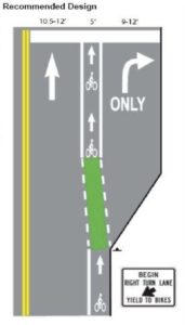
Have you noticed the green bike lanes? We were heading up Camino Del Mar (aka Hwy 101) to take our dog, Murphy, to Dog Beach and there is this intersection where Grand Avenue, Camino Del Mar and Jimmy Durante Boulevard all intersect – and there are a couple of bike lanes, too… As a driver, it causes you to slow down and take it all in so you stay in the right lane and not hit any cars, pedestrians or bikers.

Recently they painted the bike lanes green – just in this intersection. Oh my gosh! It made such a difference! Now, at a glance, you clearly see the bike lanes – and the roads stand out, too. Such a little change made such a big improvement. I love it!
This is a great example of the Similarity Gestalt Perception Principle – which is a fancy way to say “things which share characteristics such as shape, size, color, texture, value or orientation will be seen as belonging together… and the ones that are not similar stands out.” Since the bike lanes share the same general shape, size and orientation, adding the green color made them visually “pop” – standout from the car lanes and rest of the visual noise around them.

This helps us make “mental shortcuts” for acquiring and maintaining stable percepts as we are trying to navigate our vehicle to where we want to go. These shortcuts help us to shorten our decision-making time and allow us to function without constantly stopping to think about the next course of action. Pretty cool, right?
We use these same principles when we design events, spaces, objects – like your smart phone, and even software interfaces… and “Yes,” we will be talking about this at our next UX Boot Camp in Tustin, CA, May 14.